What is Data Visualisation?
With each passing day, businesses are generating more and more data on sales revenue, costs, inventory, production metrics, marketing performance, and other key performance indicators. But with so much data to look through, it can be difficult for people to see the story it tells. This is where data visualization comes to our rescue:
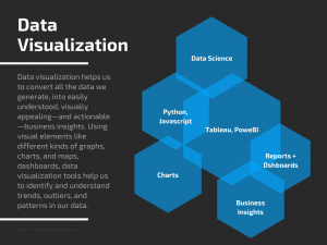
Data visualization helps us to convert all the data we generate, into easily understood, visually appealing—and actionable—business insights. Using visual elements like different kinds of graphs, charts, and maps, data visualization tools help us to identify and understand trends, outliers, and patterns in our data.
In the world of Big Data, data visualization tools and technologies are not only necessary but also essential to analyze massive amounts of information and make data-driven decisions. Today’s data visualization tools tap into external data sources, and let us see our KPIs more clearly, they unify data and apply AI/ML-driven analytics to reveal relationships between your KPIs, the market, and the world.
History of Data Visualization
Men have been using pictures to represent and understand data for centuries. From graphs and maps in the 17th century to the invention of the pie chart by William Playfair in the early 1800s and then after several decades, Charles Minard mapped Napoleon’s invasion of Russia. The map not only depicted the size of the army but also the path of Napoleon’s withdrawal from Moscow. He combined that information with time and temperature scales. Similarly, In 1854, Physician John Snow mapped the outbreak of Cholera in London.
It’s technology, however, on whose back rode the data visualization just like any other field. With the advent of technology, one could process large amounts of data at lightning-fast speeds. Today, software like Tableau, Power BI, and programming languages like Python, Javascript are helping data visualization to rapidly evolve in a blend of science and art that is certain to make a huge impact on the corporate landscape over the next few years.
Why Data Visualization is important?
The human brain is more receptive to visual modes of information therefore processing information with help of charts or graphs to visualize large amounts of complex data is easier than sifting through spreadsheets or reports. Data visualization is a fast and simple way to convey meaningful information in a manner universal to people with or without technical know-how.
Data visualization can also:
- Identify areas that need attention or improvement.
- Clarify which factors influence customer behavior.
- Help you understand which products to place where.
- Predict sales volumes.
- Create a geographic map that displays the party each state or district voted for.
- Can visualize how health indicators, such as the mortality rate of heart disease, changes across specific territories.
- Shipping companies can use visualization tools to determine the best global shipping routes.
- Visualizing stock movements and trends in share markets.
Some popular Data Visualization Techniques
Line charts: A line chart is one of the most basic and common techniques used. Line charts display how variables can change over time.
Area charts: Area charts are a visualization method that is a variation of a line chart. They display multiple values in a time series — or a sequence of data collected at consecutive, equally spaced points in time.
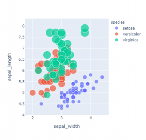
Scatter plots: This technique displays the relationship between two variables. Scatter plots are used to find the degree of correlation between two variables.
Treemaps: Treemaps visualize the hierarchical structure of a Tree Diagram. They display quantities for each category via area size. Each category has a rectangle area with their respective subcategory rectangles nested inside of it.
Population pyramids: A population pyramid graphically represents the distribution of various age groups in a population. It takes the shape of a pyramid when the population is growing. Population pyramids are used extensively in fields like ecology and humanities.
Reports: Reports are static in nature and contain data in text and table form. They can sometimes have visualizations such as basic graphs and charts. Reports are sent for timely updates to different stakeholders. They are mostly organized to highlight specific raw numbers or relevant data sets.
Dashboards: Dashboards are data management tools, customized and tailored, to display specific metrics, data, and KPIs of an organization. Data gets updated in real-time in dashboards and visuals can show changes from minute to minute.
Benefits of Data Visualisation
Data possesses a treasure trove of important actionable insights that can steer the business towards growth and profits. But the challenge lies in the fact you can’t always connect the dots by looking at raw data alone. When data is in a visual format, patterns and connections emerge that would otherwise remain oblivious to the human eye.
By bringing data to life, data visualization techniques make you the master storyteller of the insights hiding within your data. With live dashboards, reports, heatmaps, graphs, and other techniques data visualization helps users generate key business insights quickly and effectively.
Data visualization has evolved into a niche area in the field of data science. Companies are recruiting developers who work on data visualization with software like Power BI and Tableau. It has also opened great opportunities for Python and Javascript developers. These programming languages have dedicated libraries like Plotly and Bokeh for data visualization.
Let’s dive into the world of data visualization with upcoming posts in this series.